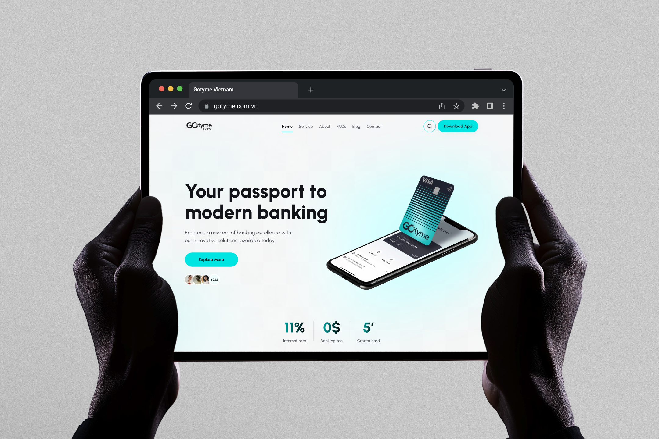
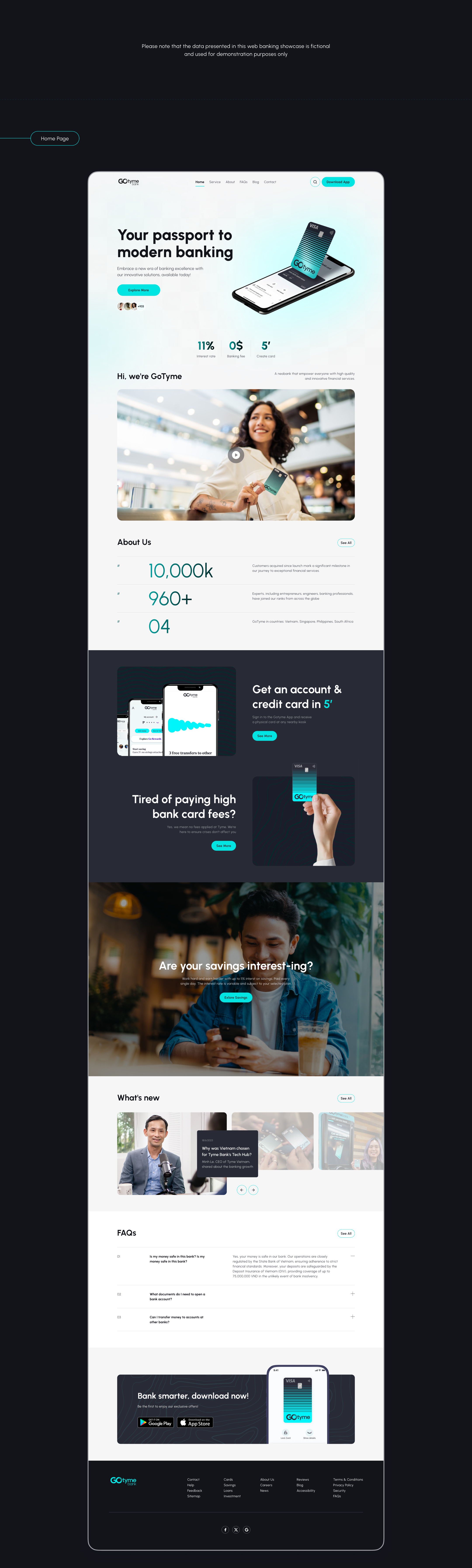
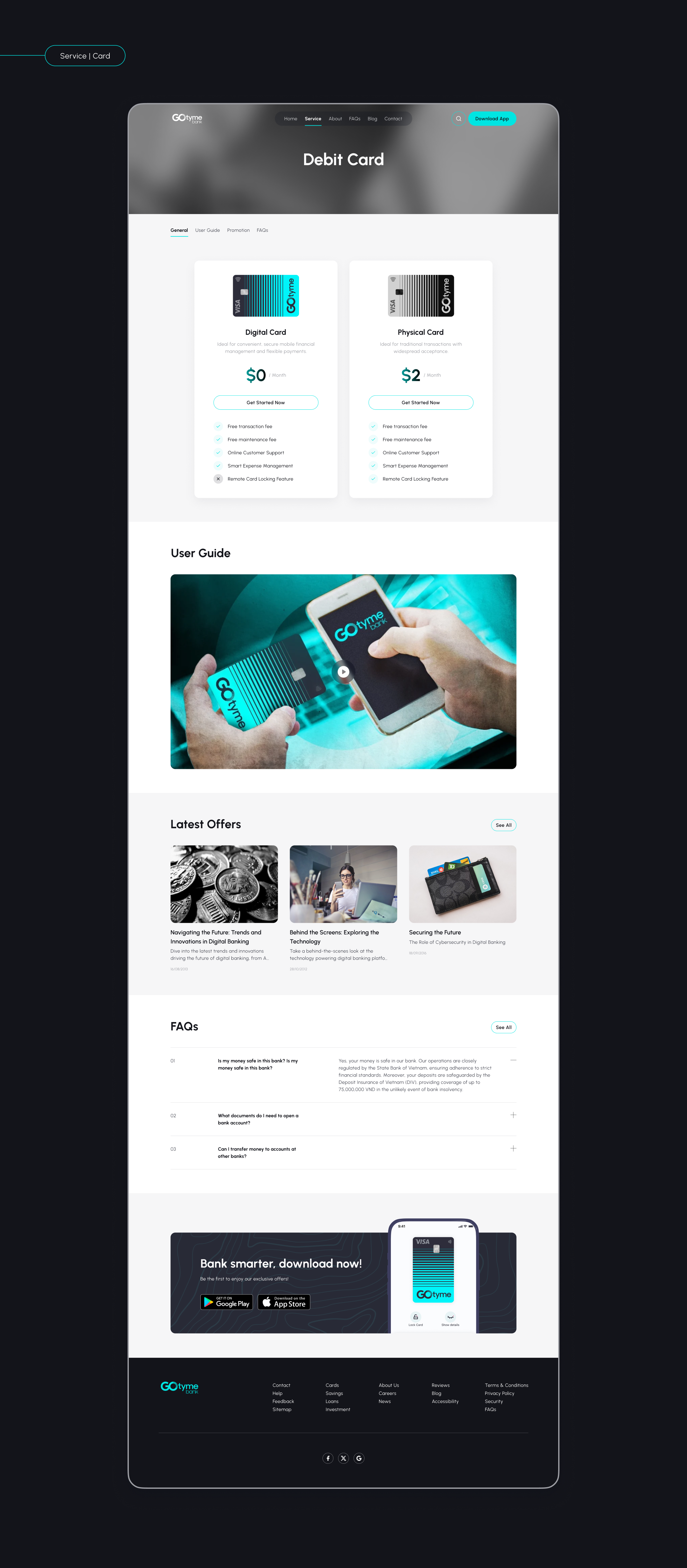
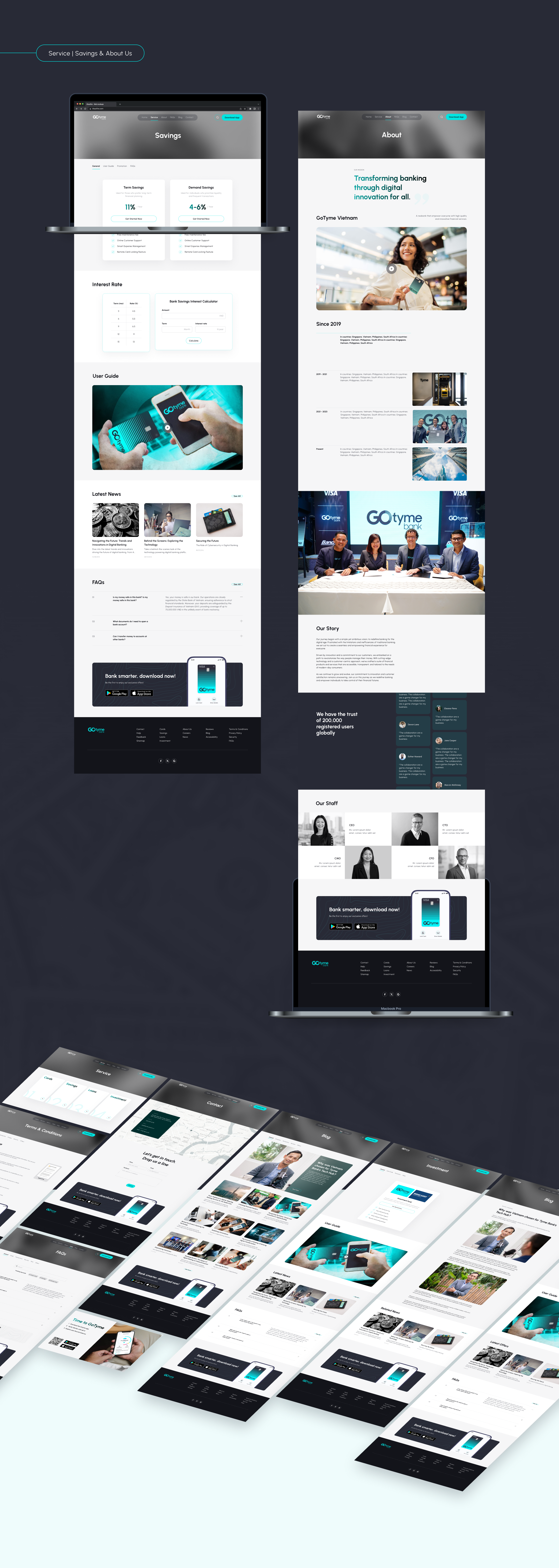
A banking website built with the purpose of Awareness, Information, and Sales & Conversion (encouraging users from browsing information on the website to using the bank's services by downloading the mobile app).
Demographics:
Problem:
They demand a digital-only bank offering swift card issuance, rapid international transfers, and competitive deposit rates.
Needs:
Prioritize convenience, efficiency, flexibility in financial services.
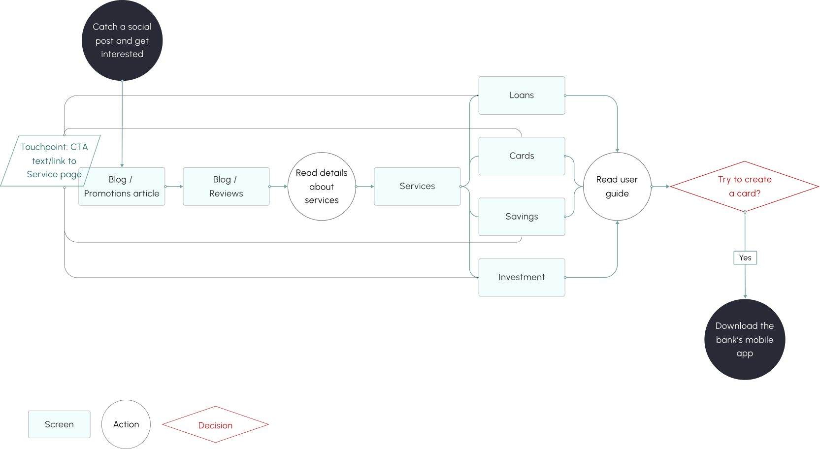
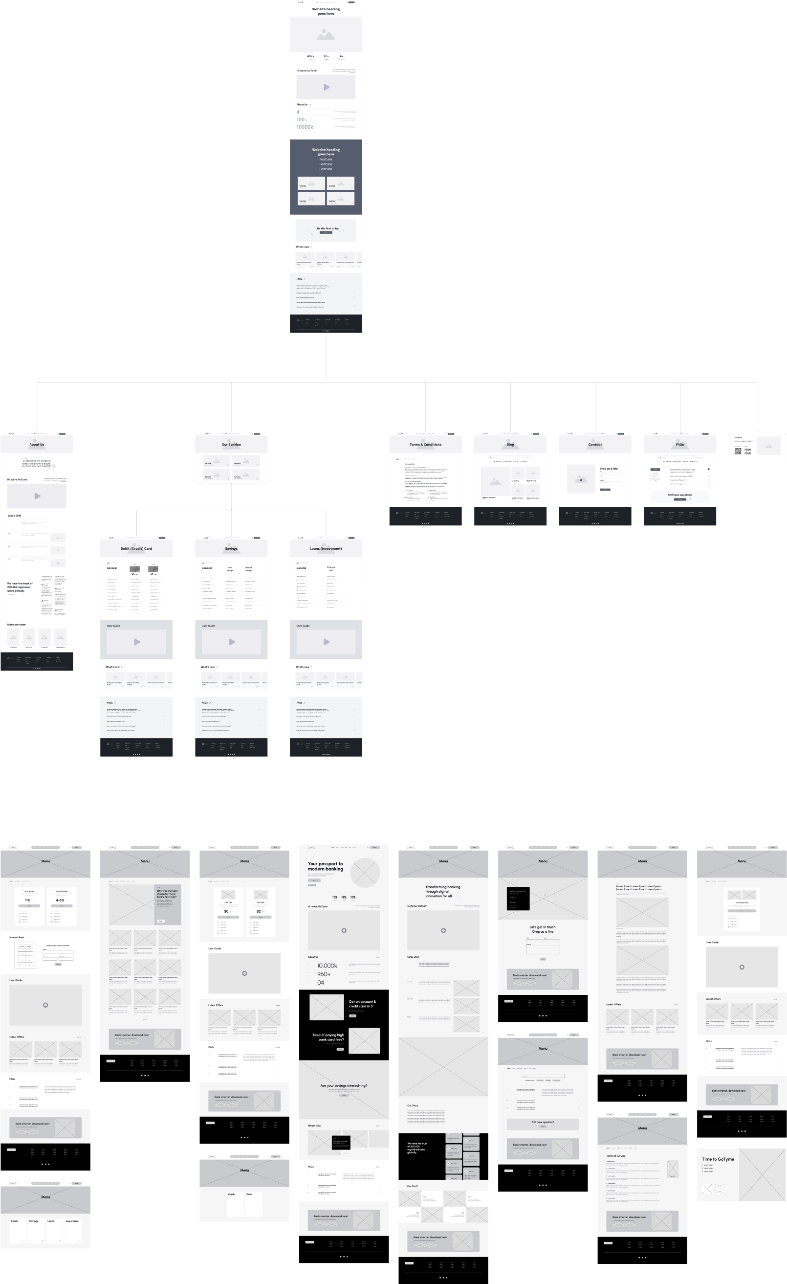
This user flow is based on the scenario where, once a marketing campaign starts on social media, users may become interested through posts (e.g., on Facebook) and begin their discovery path.
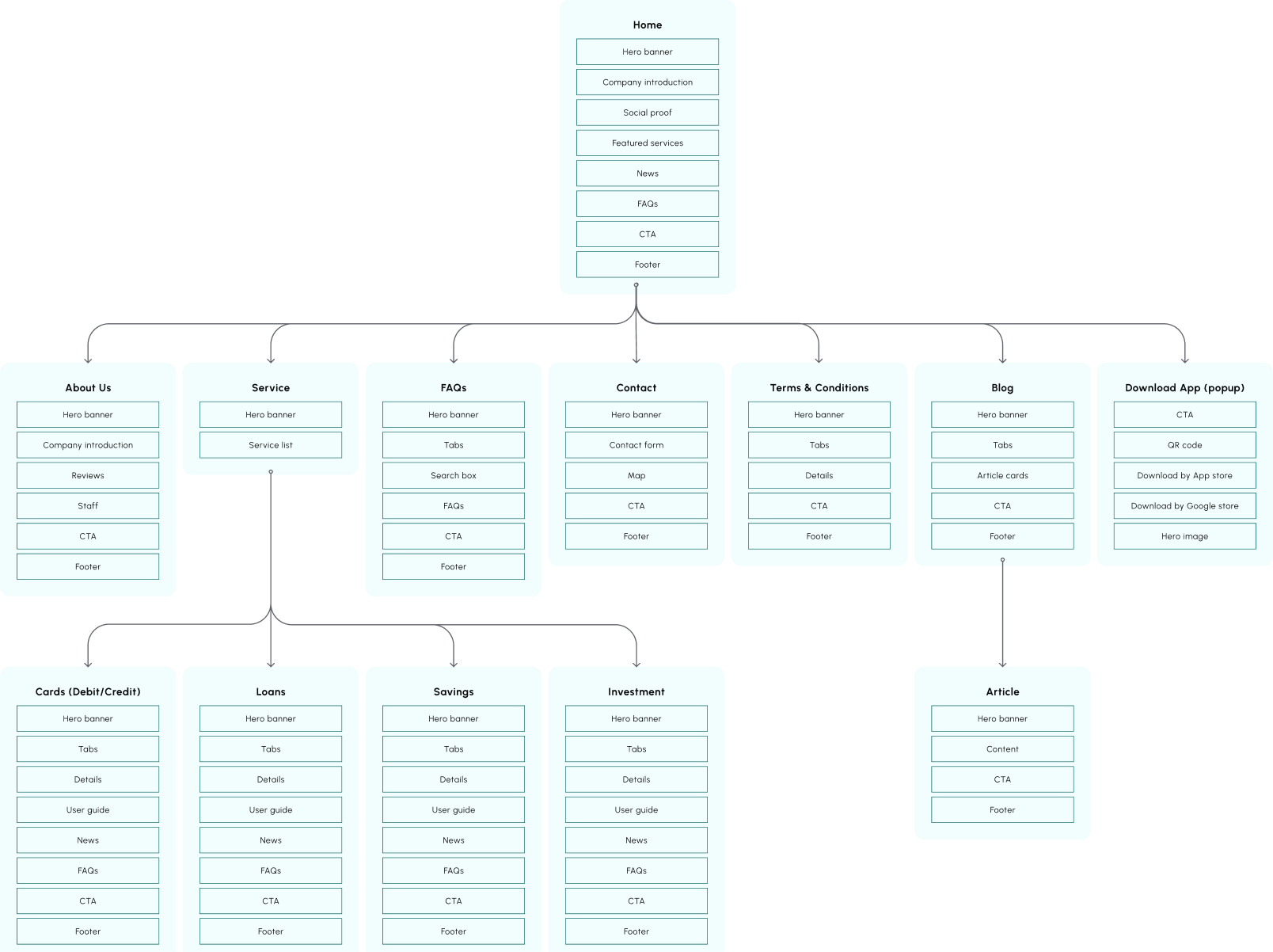
The information architecture (IA) was built with detailed sections on each page. This helped me ensure I didn't miss or forget important information.
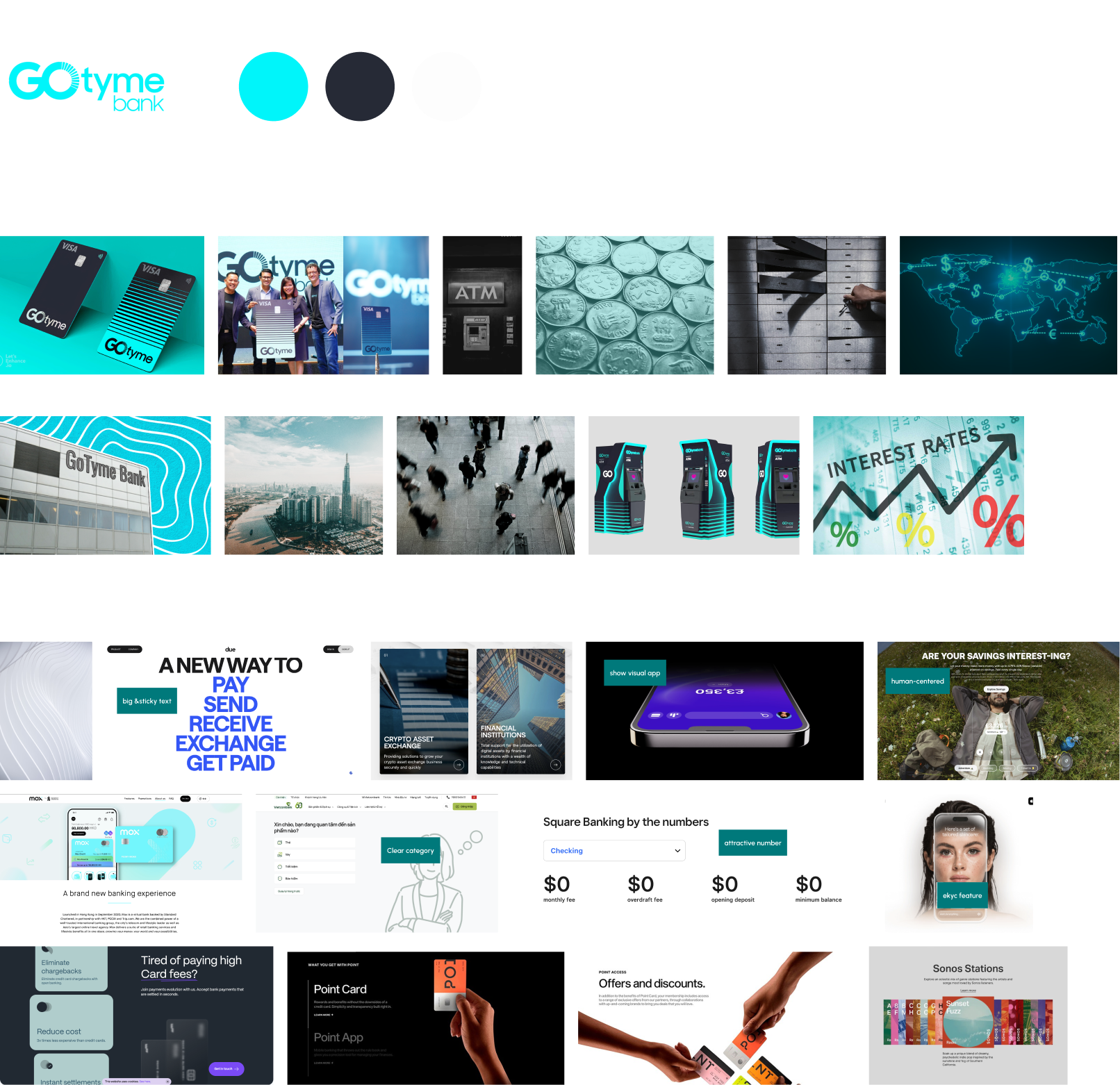
Including the brand’s assets such as the logo, colors, and images. Moreover, I collected some styles that I'll follow.
I created low-fidelity wireframes on Visily. The purpose of this phase is to establish the content flow for the website before proceeding to design. My preferred framework for this is AIDA: Attention, Interest, Desire, & Action.
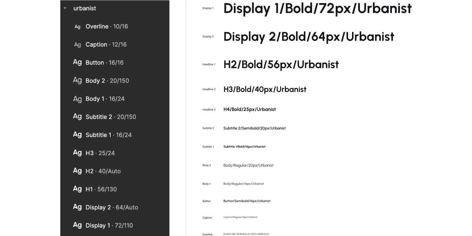
I used Urbanist for both the display and body text in this project.
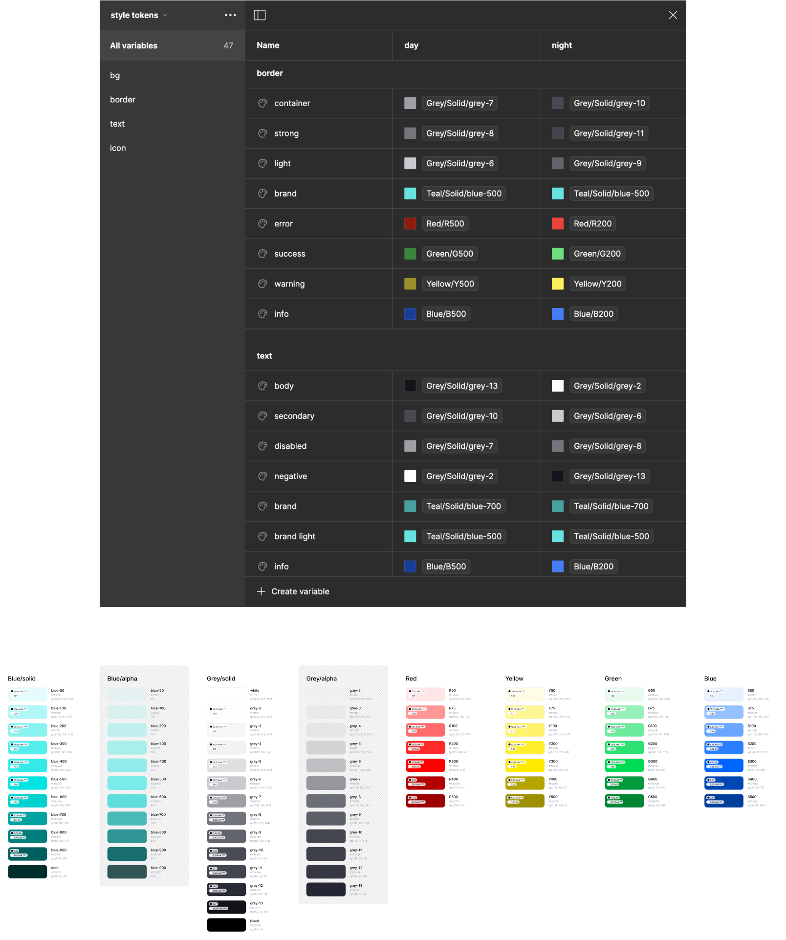
Blue #00E5E2 is the accent (brand) color. I also have neutral and semantic colors. Besides the solid colors, alpha colors helped make the interface more subtle in some cases.
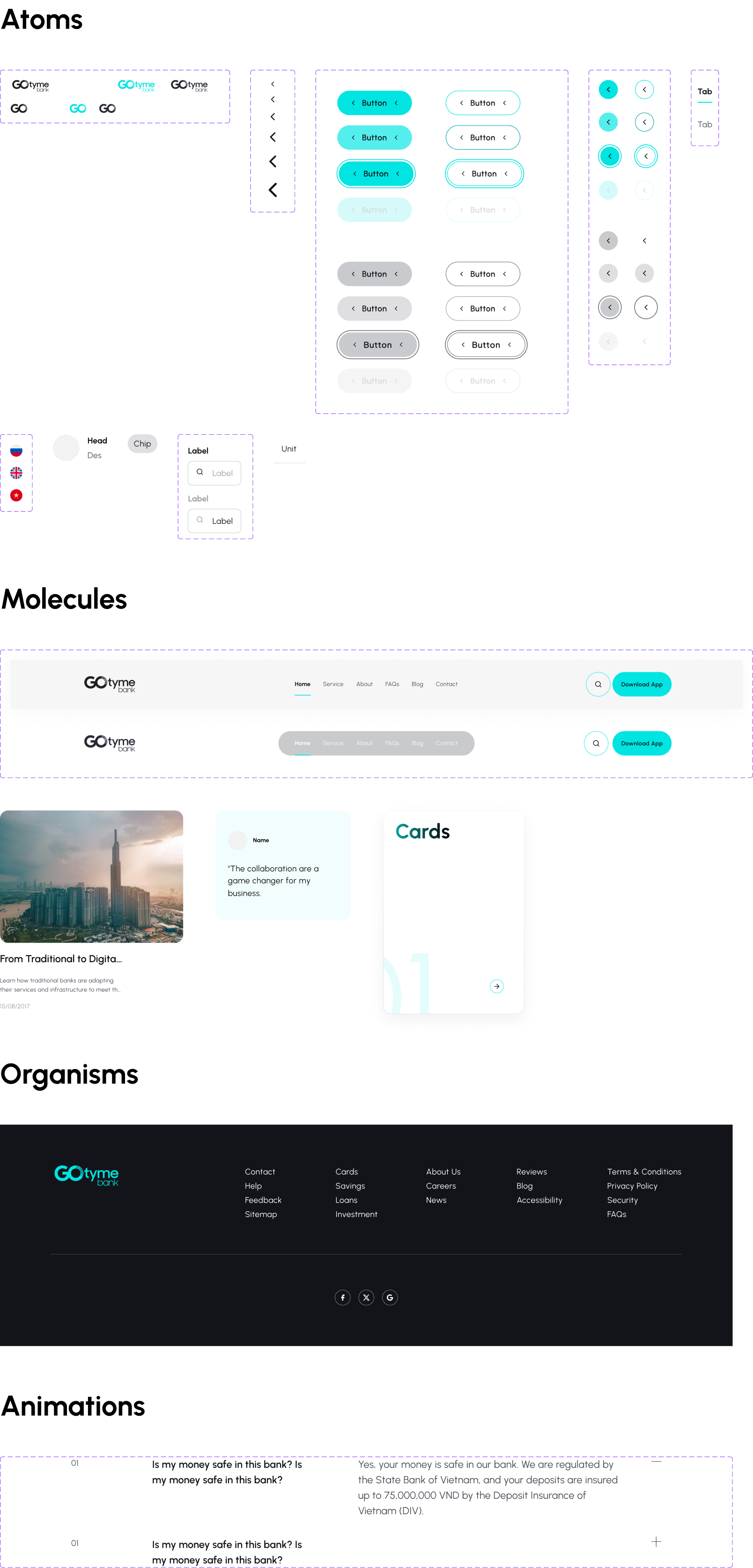
Meet my favorite set of simply beautiful open-source icons: the Feather Icons pack.
My favorite approach in this realm is "Atomic Design." It begins with the smallest pieces—atoms—and expands into molecules, organisms, templates, and pages. In this project, however, I've only reached the organisms stage.
Overview
Pre-design
Design System
Visuals
This portfolio was coded by me and is currently being recoded for responsiveness